Mealmate is a concept app which provides people with a platform to find affordable and healthy homemade food. It includes features such as hiring a professional cook, paying via the app, and ordering a tiffin with the pay-per-order option.
Project Details
Mealmate App Design
Timeline – Dec – Feb 2021 ( 9 Weeks )
Team: Akash Raje, UX Consultant, Dafter Inc.
The Initial Hypothesis
To create a convenient online platform, i.e. an app, where people can find professional cooks nearby who can cook healthy food of their choice, also find tiffin services which allow pay per order and a monthly tiffin service.
The focus is on providing affordable homemade healthy food.
Demographics of target users —
• Location: Tier 1, Tier 2 Cities in India
• Busy Professionals, students
• Age: 20 to 50 Years
• Mid to High tech-savvy
• Languages: English, Hindi, and Other regional languages
Empathise
It was very insightful to leverage rich qualitative data from potential users’ past experiences with ordering food online and professional cook services; this stage included user research by conducting user interviews and usability tests with similar products.
I started with brainstorming to come up with a user interview questions guide. As I wanted to understand user behaviour from their past experiences, I kept them more open-ended to validate my assumptions.
Ideate
Now with a clear understanding of the user scenarios where users need helpful features, I brainstormed with How Might We questions to come up with possible solutions; after this, I could start working on Information architecture which provided me with transparency of the steps user will take to accomplish a goal.
How might we introduce the features such as ordering a tiffin & hiring a professional cook in an app with efficient experience that provides the users freedom of their choice.
Prototype
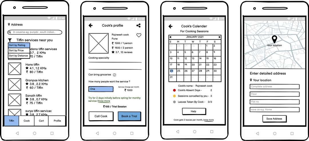
The essential features and content for the app were finalised at the end of the ideation phase. After that, I started creating sketches of app screens to visualise and iterate quickly before moving to digital design.

Usability Test Using Wireframes
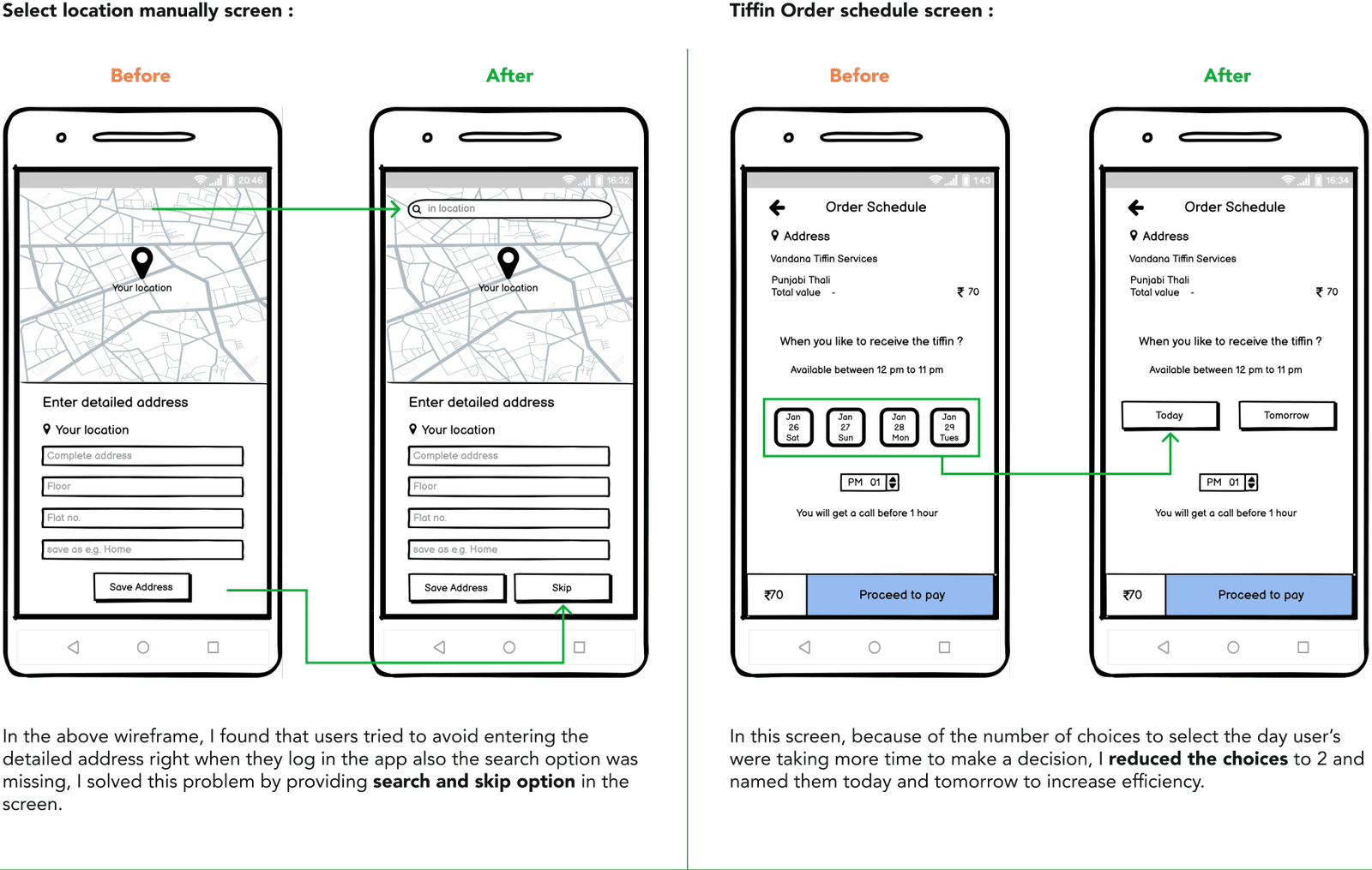
To understand which Ideas are working and validate my assumptions before jumping to visual design, I used these wireframes for a usability test with five potential users from varied demographics via a screen-sharing web app and collected their feedback. The followings are a few design problems I found with the test.

Visual Design
Now It was time to start visual design to create emotion in the design and enhance user experience; in this phase, I did some experiments with a mood board for the look and feel of the design, and then I had to come up with a user-friendly logo, suitable images, typography, layout and colours.
Logo and Color Scheme
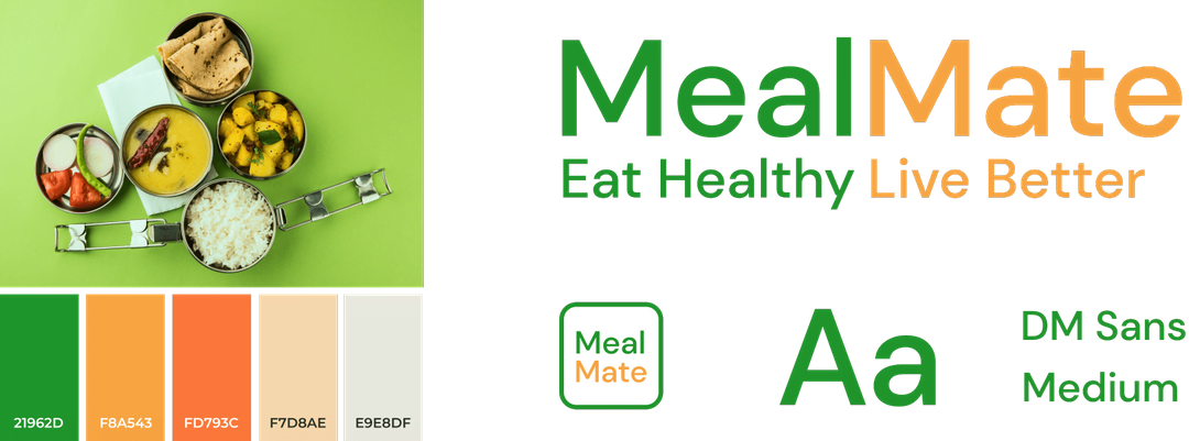
I created a simple, minimal, clean, and easy-to-understand logo for the brand identity and value proposition.
A tiffin food photograph colours inspire the colour scheme. I used green as a primary colour to symbolise nature and healthy food. I used it while maintaining its relevance to India, conveying the message about healthy food and user accessibility in mind.

Outcome
Read the complete case study on akashraje.in.
